
Wedding Invitation
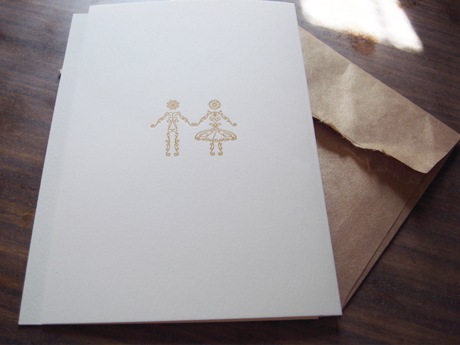
I have designed a wedding invitation card for my friend since high school. I have picked an old poster from a design book and traced and re-composed the decorative elements. There are plenty of swirl design these days, but I love the fact that the thickness of the line remain the same from starting to the end.
The printing is done by Daishin Insatsu. They are a small factory near Asakusa.
Letter press used be major method of printing and nowadays it is popular again for its simplicity and tactility. The trend is to press a bit hard so that you can feel the dent with your fingers. Dent used to be despised by the printers because the papers become wobbly when they are bound together. Nowadays, it is a sign of craft making. Very understanding of this (slightly contradictory) trend, daishin insatsu happily offers strong press.
高校の先輩の結婚式の招待状をデザインさせてもらいました。本に出ていた古いポスターの要素をトレースして、パーツを組み直してみました。最近こういうデコラティブなデザインをよく見ますけど、ラインの太さを均一にして、軽い感じにしたのがポイントです。
招待状の表面は活版印刷。大伸印刷さんにお願いしました。
活版は昔からの技術が最近また流行っているもので、ちかごろの主流はちょっと深めに押して紙に凹凸を付けるというもの。昔からやっている印刷所さんたちは、凹凸をつけることを嫌うところが多いらしいのですが(本来書籍に印刷するときに紙に凹凸がついたり、裏に出てしまうのは好ましいものではなかったため。でも昔持っていた金の星社のシートンシリーズは確か活版で、紙のかすかな凹凸がすごく好きだったなあ)、大伸印刷さんは快く押しをつけてくれます。
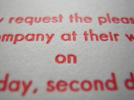
イラレデータで見ると「ふ〜ん」て感じなのですが、活版で押されると急にかわいくなるから不思議。活版マジックです。
紙はアラベールの200kg、色はナチュラルを使用。
細かい質感がノーブルな感じの紙です。